
Where brands
find their roots
Logofolio & Visual Identities
Every brand starts as a seed, an idea waiting for light, care, and a bit of curiosity. My logo and identity work is about helping those ideas grow strong foundations and real personality. Each design is grown with empathy, strategy, and heart, made to feel alive, confident, and deeply rooted in meaning.
1.
Bluem Designs
2025
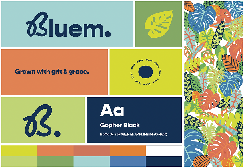
Project: Personal Identity
Bluem’s visual identity is rooted in modern minimalism with a touch of wildflower charm. It uses clean lines, organic forms, and layered compositions to create a sense of structure that still feels alive. The colour palette, a mix of cobalt blues, soft sage, and playful accents, reflects calm confidence and creativity in motion.
Typography is thoughtful and balanced, pairing gentle curves with bold clarity to echo Bluem’s mix of grace and grit. Each design feels like a small ecosystem of its own: intentional, tactile, and quietly expressive. Bluem’s identity isn’t about decoration, it’s about design that grows, connects, and leaves something meaningful behind.

2.
Sprig & Co.
2025
Project: Brand Identity
Sprig & Co. is a warm, joyful brand that celebrates growth, community, and connection with nature. The identity captures the feeling of fresh beginnings: calm but full of life.
The logo takes inspiration from leaves and organic shapes, giving it a soft, approachable look that feels naturally inviting. The colour palette mixes deep forest tones with bright greens, mints, and touches of yellow. This creates a sense of freshness and positivity. Paired with friendly, rounded typography and hand-drawn icons, the identity feels modern yet comforting, like a breath of fresh air.
Every detail was designed to make Sprig & Co. feel alive, nurturing, and full of personality.

3.
Threads of Hope
2025
Project: Campaign Identity
Threads of Hope is a heartfelt visual identity created for an SPCA campaign in partnership with Yaga, a second-hand online fashion platform. The concept celebrates the connection between animal rescue and pre-loved fashion, showing how something once discarded can be given a second chance.
The identity combines the SPCA’s calm blue with Yaga’s cheerful orange to reflect both care and creativity. Friendly patterns, soft shapes, and playful lettering bring warmth and personality to the design. Subtle animal details, like a cat-shaped “P” and dog-eared “H,” remind viewers of the cause behind it all.
The result is a brand that feels kind, hopeful, and full of life. It’s a reminder that every little act of compassion can help rescue, renew, and inspire hope.
