
Unwrapping the Roots
Packaging Design
Packaging isn’t just about what’s inside — it’s about what it feels like to open it. Each design I create begins with a story, growing through texture, colour, and form until it becomes something you want to hold onto. I design packaging that speaks softly but leaves a lasting mark — where thought meets touch, and care lives in every fold.
Stumpnose Brewery
Beer Can Redesign
2024
Project: Winemag Student Awards 2024
Awards:
-
Gold Winner - WineMag Student Label Awards 2024
-
Finalist - Loeries Awards 2025, Packaging Design Category
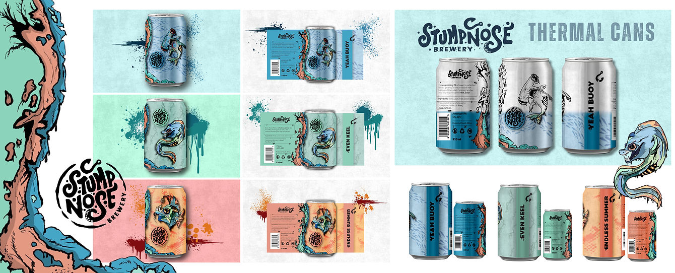
The redesigned Stumpnose cans introduce a playful and dynamic twist to craft beer packaging, blending bold illustration with interactive design.
At room temperature, the cans appear in striking black-and-white line art, celebrating expressive character and clean detail. Once chilled, thermal-reactive ink reveals vibrant colour and ocean-inspired artwork, creating a surprising moment of discovery for the consumer.
Each flavour is represented by a different sea creature, allowing every can to stand proudly on its own while forming a cohesive visual family rooted in the brand’s coastal heritage. This thoughtful balance of storytelling, creativity, and innovation transforms the cans into collectible pieces and reinforces Stumpnose’s adventurous, fun-loving spirit.
1.
1.
Bluem Designs
2025
Project: Personal Identity
Bluem’s visual identity is rooted in modern minimalism with a touch of wildflower charm. It uses clean lines, organic forms, and layered compositions to create a sense of structure that still feels alive. The colour palette, a mix of cobalt blues, soft sage, and playful accents, reflects calm confidence and creativity in motion.
Typography is thoughtful and balanced, pairing gentle curves with bold clarity to echo Bluem’s mix of grace and grit. Each design feels like a small ecosystem of its own: intentional, tactile, and quietly expressive. Bluem’s identity isn’t about decoration, it’s about design that grows, connects, and leaves something meaningful behind.
Yococo Ice Cream Packaging Redesign
2025
Project: Brand Challenge
This packaging brings Yococo’s playful, love-filled personality to life through bold colours, soft flower-inspired shapes, and a joyful visual language. Every element works together to capture the brand’s uplifting spirit and its mission to “serve love in scoops,” offering a warm and inviting first impression.
Designed to stand out in a competitive frozen aisle, the bright palette and clean, minimalist layout draw attention immediately. The combination of expressive silhouettes and gentle curves creates a sense of movement and delight, while the friendly tone of voice reinforces accessibility, positivity, and mindful indulgence.
With no advocate at the point of sale, the pack was carefully considered to communicate both flavour and feeling on its own. Through thoughtful hierarchy, playful illustration, and encouraging, human-centred language, the packaging invites connection and reassures customers that this product is made with care, kindness, and conscious intention, turning every tub into a tiny moment of happiness.
2.
1.
Bluem Designs
2025
Project: Personal Identity
Bluem’s visual identity is rooted in modern minimalism with a touch of wildflower charm. It uses clean lines, organic forms, and layered compositions to create a sense of structure that still feels alive. The colour palette, a mix of cobalt blues, soft sage, and playful accents, reflects calm confidence and creativity in motion.
Typography is thoughtful and balanced, pairing gentle curves with bold clarity to echo Bluem’s mix of grace and grit. Each design feels like a small ecosystem of its own: intentional, tactile, and quietly expressive. Bluem’s identity isn’t about decoration, it’s about design that grows, connects, and leaves something meaningful behind.
2.


The Bluem Box
2025
Project: Packaging as a self-portrait
The Bluem Box is a self-portrait in the form of packaging, created from the prompt of imagining what I would be if I were an item of packaging. It is designed to protect a live plant during transit while offering an unboxing experience that feels gentle, intentional, and deeply human.
The structure is a tall, upright form with a custom die-cut insert that hugs the plant pot securely, limiting movement and absorbing shock. Beneath the pot sits a seeded base platform made from a biodegradable binder and wildflower seeds, strong enough to support the plant but designed to be planted after unboxing so nothing goes to waste. The box folds together with clean, efficient panels that remove the need for excess tape, and every measurement and tolerance was tested through hand-cut prototypes and full-scale mockups to ensure a perfect fit.
Made from seeded or recycled kraft board, printed with low-VOC or soy-based inks, and kept uncoated for a natural, warm handfeel, the Bluem Box prioritises sustainability at every turn. Hand-drawn plant illustrations wrap around the exterior, paired with a handwritten-style letter that reflects my design philosophy and invites a moment of connection. Clear, friendly iconography guides the user through removing the insert, lifting the pot, and planting the seeded base, turning the unboxing into a small ritual.
As the box opens, the user moves from curiosity to discovery, uncovering layered details and textures that feel alive and personal. The entire system was prototyped physically and digitally, including seed-base strength tests and 3D models in Blender to visualise how the illustrations would wrap. The final result is packaging with a second life, where the panels can be composted or planted, the insert reused, and the seeded base grown into flowers.
Designed for plant lovers, conscious consumers, and creative directors who value thoughtful, story-rich design, the Bluem Box embodies the core of Bluem: empathy, craft, sustainability, and the belief that design should grow something lasting.
3.

